Anatomy of a Thesis

What Do We Know About How It Was Typed? 

For starters, we can’t say for certain how Dennis’ thesis was typed.  Our experts Chuck Bigelow and David Brailsford believe it was typed on an IBM Selectric typewriter with golf-ball typing element, but thus far they have not been able to identify a specific IBM type element that possessed the exact fonts used by the thesis.  There is a lot to suggest a Selectric so our description below assumes that is what Dennis used, but the possibility remains that it was typed on an IBM Executive, an Olivetti, or some other manual typewriter popular in the mid 1960’s.  

Dennis could have typed it himself, or potentially he could have had it professionally typed by a technical secretary.  According to fellow student Albert Meyer, it was common at Harvard for a student’s thesis advisor to have access to a department secretary who could be recruited for typing duty.  In fall 1967 when the document presumably was being written, Dennis lived in New Jersey and worked at Bell Labs.  It is also conceivable that a Bell Labs technical typist produced his thesis for him.

Another possibility is that he typed his thesis on an IBM 2741 terminal connected with CTSS to an IBM 7030 computer at MIT.  The 2741 uses a Selectric typewriter mechanism, in theory anything typed by hand on a Selectric should also be able to be typed using software commands along with manual adjustments on a 2741.  We know that Dennis had a CTSS account from grad school days that remained active at the Labs with the Multics project.  Our family recalls that Dennis had a WATS line and a Selectric style terminal in his home basement office though can’t recall when these were installed.

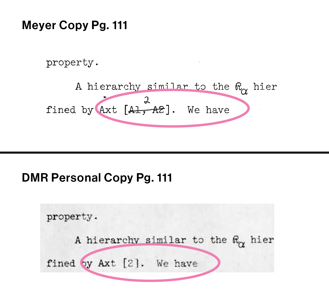
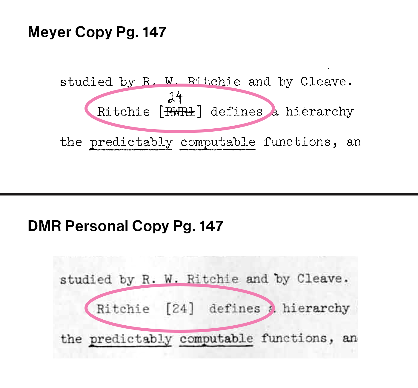
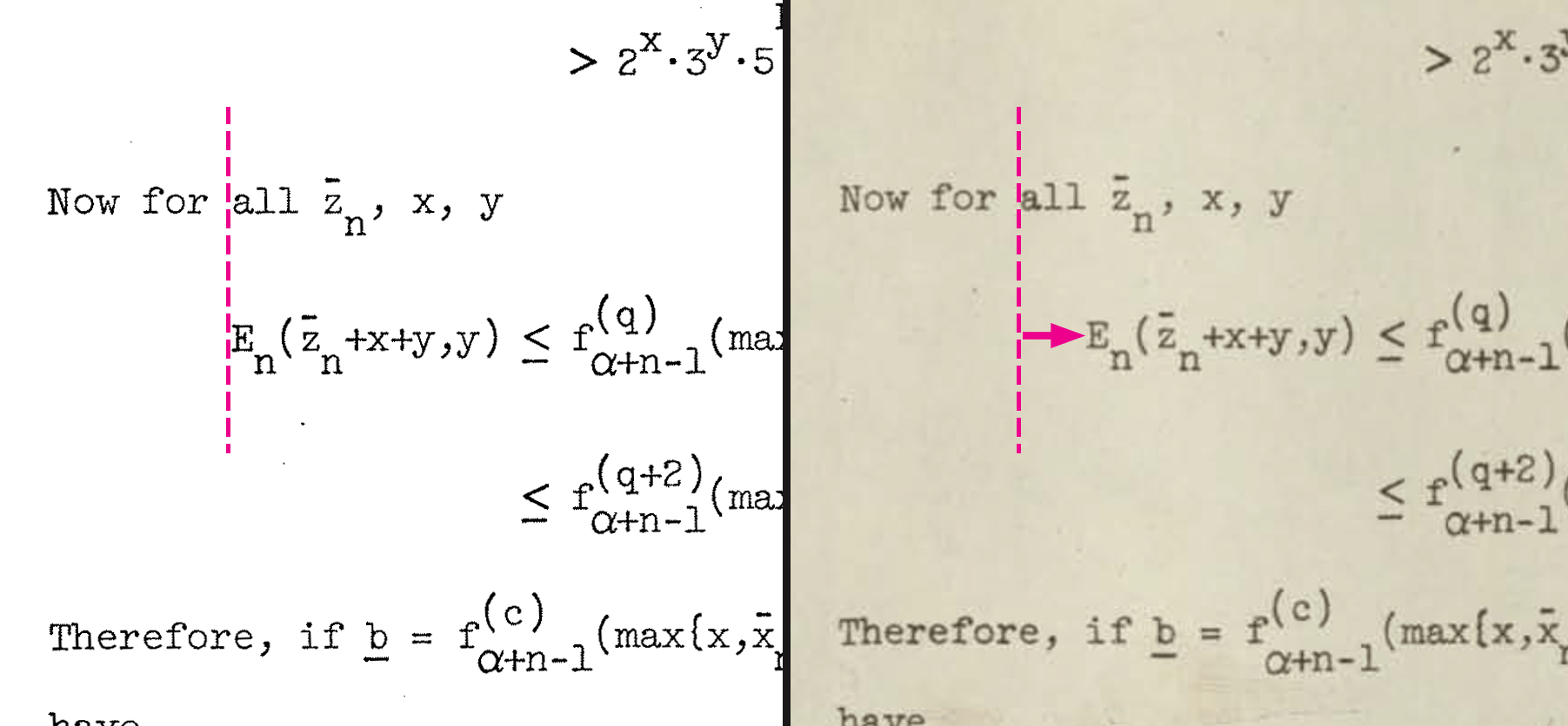
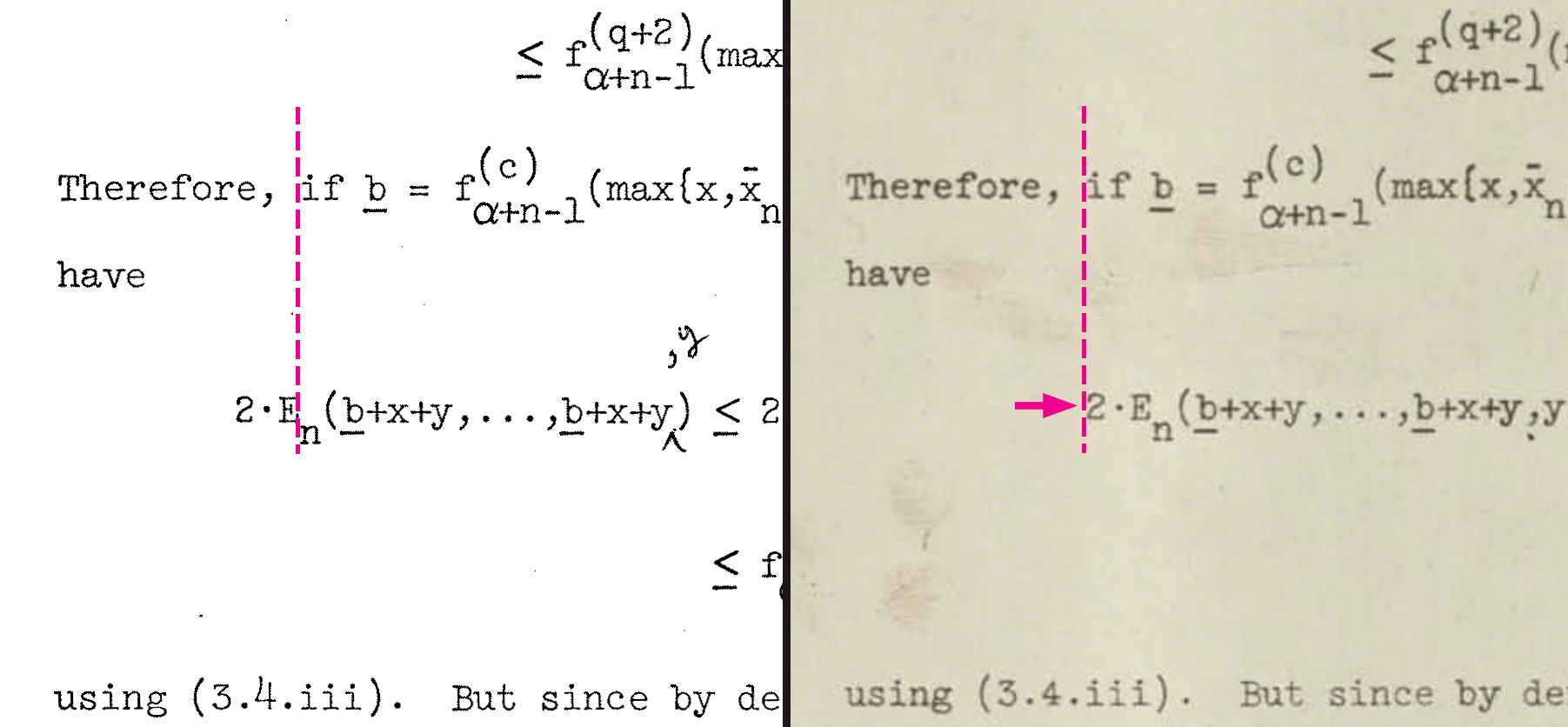
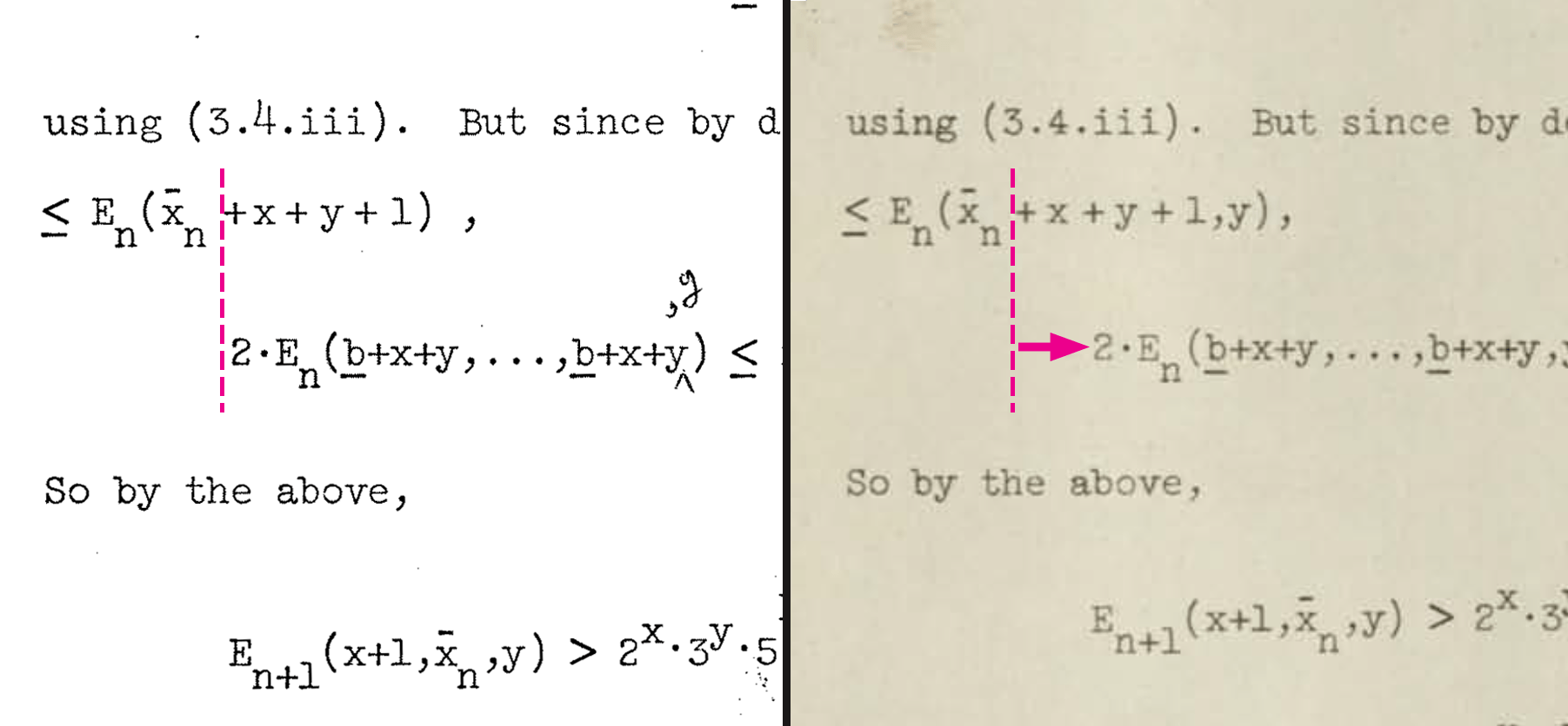
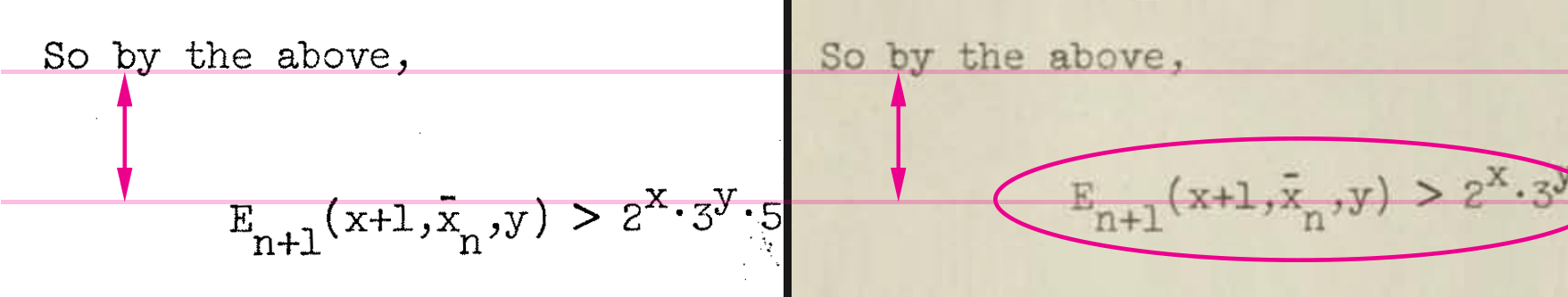
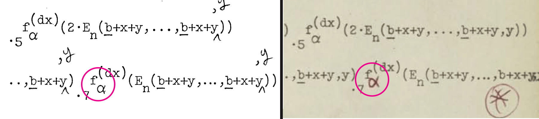
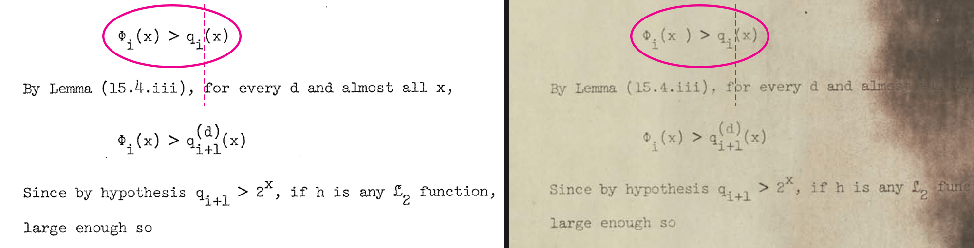
Typographically, the thesis is dense and complicated, full of multi-level mathematical equations and special symbols.  It runs nearly 180 pages.  Most of the pages include at least a few sub-and-superscripts, many pages are brimming with them.  Dennis used about 40 different mathematical characters and Greek letters throughout the dissertation.

Its typographical complexity alone made Dennis’ thesis an outlier.  The technology of the day required that each sub-and-superscript character be hand-adjusted on the page using manual escape mechanisms.  This was a labor intensive process,  the more characters needing adjustment the more labor required.  Dennis didn’t hold back, his dissertation could well have been the “hardest” thesis for a typist to clack out of any dissertation from the 1960s.    

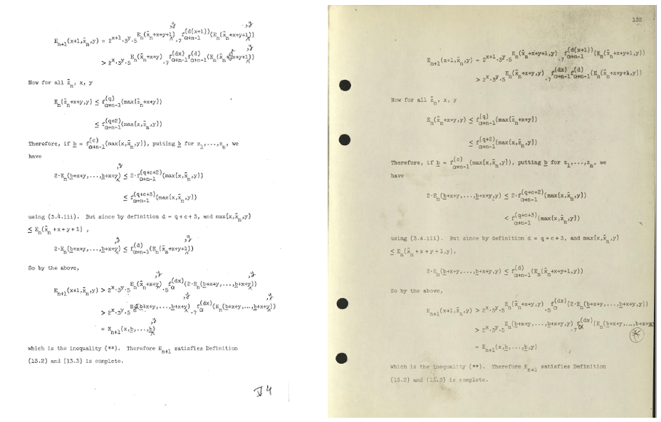
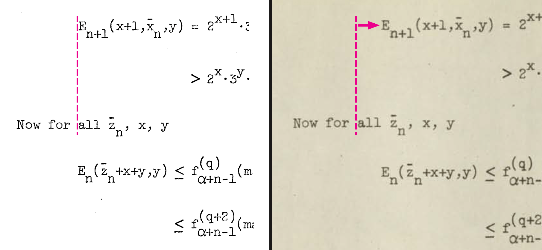
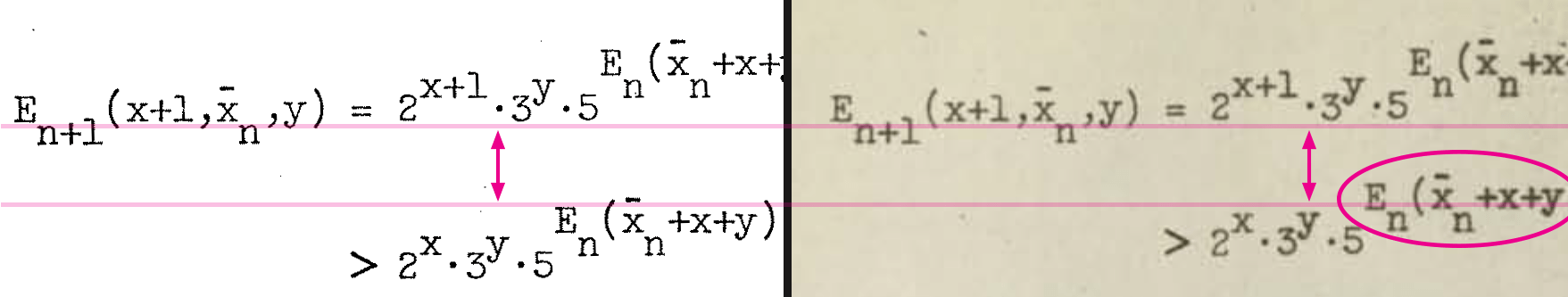
There’s another feature that distinguishes this thesis other 1960s math dissertations.  Dennis positioned his sub-and-superscript characters exactly above or below their main reference line, not at fractional distance as was common to other math papers.  As we examine the dissertation page by page, it appears that all the characters are being controlled together.  The positioning aligns to a grid system, each character impression placed exactly where it should be, no indication of manual adjustment even with multi-layered sub-and-superscripts.  

We don’t know how this could be.  According to the experts, there were no typewriters or terminals in 1967, including the Selectric, that could have achieved this result.  But according to our experts also, there is no way that this document could have been hand-typed by a human being using escape adjustments to place all the sub/superscripts… everything is just too uniform.  

So… rather than trying to explain how this might be, we chose to document the phenomenon itself.  It turns out that the individual typed characters in the dmr thesis conform precisely into a 1/12” by 1/12” grid.  This pattern reveals itself when we overlay a mesh pattern onto the page.

Page 50 Section on a Grid (Click image to expand to full page)

Look closely at the positions of the characters in this Page 50 highlight.  Focusing horizontally across each line, it is not a surprise that the characters fit so neatly into our 1/12” grid.  The thesis was typed on a 12 Pitch machine, which meant that the typewriter was set to type 12 characters per inch as a standard.

Now look vertically, line by line up and down the page.  More surprisingly, the characters appear to fit as neatly into a 1/12” vertical grid as do the horizontal characters to their horizontal grid.  It seems that there could be 12 actively used lines per inch, and that each sub-or-superscript level could be allocated its own line.


The question naturally arises whether Page 50 is an outlier or a snippet of brilliant work by an expert typist that is not sustained across all the pages.  To test this, using the Albert version thesis copy we gridded all the pages that end in “6” (there are 18 of them), and bundled these into a PDF, giving a cross-sectional slice through the dissertation.

Our conclusion is that for the main thesis body, starting on Pg. 23 with “II.  Loop Programs” until last Pg. 179, the characters do conform to a 1/12” by 1/12” grid system.

For the Title Page, the Synopsis (pp. 2-6), Introduction (pp. 7-22), and the REFERENCES (pp. 180-181), this grid system does not fit as well.  

We’re not sure what this means.  For these sections we are not sure about, we have created a second sample PDF file.  Here we sampled every third page, using a 1/6” grid, to get a different look at these pages.

Please have a look yourself, draw your own conclusions.

Of course the placement of every character on every page does not fit perfectly to the grid, there are plenty of places one can point to and say “These characters are behaving a little differently…”.  It’s a mystery, no one is denying this.

But as we have studied these patterns, what we found is that more often than not what looks at first like pattern disruptions is actually evidence of additional control of character placement.  We see this with Vertical Control, the adjustment of lines per inch.  We see it with Horizontal Control, the spacing of and between characters along a line.  And in a “dog that didn’t bark” sense, we see it with Version Control, managing character placement between document drafts.

Vertical Control

Vertical control is control over line heights.  With this system; the use of 1/12” line heights provides a channel for subscripts and superscripts to be included within the control structure.  

We combed through the thesis and, to illustrate this phenomenon as clearly as possible, selected a dozen sample pages to highlight that feature extended vertical control.  These are shown below along with our comments.  (NOTE: To see an entire thesis page, click on the image.)

Each of these pages is a fascinating study on its own.  Be sure to look at Pgs 76 and 106 especially where it looks like superscripts have been laid down exactly bisecting of the boundary between two lines.  Could these have been laid down on a 1/24” line height?

SAMPLE 1:

Take a look at Page 56

Presented here within a cross-hatch grid, this is an example where all characters including sub-and-superscripts conform exactly to a 12 line per inch standard.

SAMPLE 2:

Page 139 is another example showing how well these characters conform to a 1/12” by 1/12” grid. 

Notice the six line sections down the page where two extra blank 1/12” lines have been inserted to add spacing between sections.  

SAMPLE 3:

Page 136 begins with a 5-layer mathematical expression, 1 superscript above and 3 levels of subscript below the main line.  For this equation and everywhere on the page, examine how closely all of these complicated layers of characters conform to this 1/12” grid.

 SAMPLES 4 & 5:

Several of the thesis pages, including Page 63 and Page 66, format differently, there is not a foundation of 3 primary lines per inch here.  Nonetheless the 1/12” by 1/12” grid tracks perfectly with the placement of the characters and lines with both these pages.

SAMPLES 6 & 7:

Not all characters fit to the grid at all times. Page 47 and Page 152 are representative examples where some of the characters have strayed off the grid.  See the marked areas on the images for detail.

SAMPLE 8:

Page 97 is a high water mark for off-grid sub/superscripting. 

We’re not sure what was happening here.  It’s interesting to note that several of the off-grid equations follow a similar pattern, and even though each is off the grid they are all off the grid in the same way.  These aren’t random fluctuations, they are off-grid patterns.

SAMPLES 9 & 10:

Page 76 and Page 106 each feature a special superscript which seems to follow 1/24” rather than 1/12” calibrations.  Take a close look at the circled equations, how do you explain this?

SAMPLE 11:

Page 52 is filled with characters that stray off the grid.  However, closer inspection reveals that most of these off-grid expressions are very similar to each other.  Each individual math expression is indeed off the grid, but they are all off the grid in the same way.  This is not random!

 SAMPLE 12:

The REFERENCE pages at the back of the thesis don’t fit smoothly into the 1/12” by 1/12” grid.  The line spacings stray slightly down the page, in a similar way to the MIT theses of the day.  Could it be that these REFERENCES were typed separately, using a different typewriter, from the main body of the thesis?

Horizontal Control 

Horizontal control is control over character widths and spacing between characters.  Unlike vertical control which redefined how sub-and-superscripts could be handled, there is no technical need to have customized character spacing in the thesis.  The only reason to employ this would be for cosmetic graphic design purposes.  Or for fun, to show off a new idea. 

We have discovered evidence of two different forms of Horizontal Control used in the dissertation.

Roman Numeral Lists

Dennis used a “Roman Numeral” listing technique for enumeration when necessary.  This is an important technique for him, he used it 16 times.

All characters in the first three lists conform to the 1/12” by 1/12” grid system.

Page 23
Page 30
Page 32

However, starting with the fourth list on page 39, a remarkable change occurs… the Roman Numeral lists center-justify, so that the numeral “(ii)” splits the difference with numeral “(i)”, all characters shift one half step (1/24”) to the left.  Similarly, “(iv)” shifts 1/24” to the right from “(iii)”.

Page 39

This and the remaining 12 lists are all center-justified.  This means that each even-numbered-numeral on each list, has been adjusted by 1/24” to the left or right from the 1/12” grid.

Page 44
Page 57
Page 89
Page 111
Page 113
Page 125
Page 158
Page 161
Page 169
Page 170
Page 179
Page 45 - Roman Numeral Grid Shift


It gets more weird.  For fifteen of the Roman Numeral lists, the main body copy below the list itself is justified inside the grid same as the copy above the list.  

Page 45 is an exception:  all characters in the final nine lines of this page are half-shifted off the grid, in alignment with the final numeral (x) of the Roman Numeral list on that page.  Maybe there’s an easy explanation, like the typist forgot to adjust back after finishing off the “(x)”.  Or maybe somebody forgot to reset the routine?

“+” Spacing

For reasons we don’t understand, the Plus character “+” in some cases is allowed to shift 1/24”, so that it straddles the grid line and serves to occupy two character spaces with one character.

Here are three example pages that clearly indicate the two different spacings that the Plus character can take.

Page 136 - Plus signs


Page 136 likely has more “+” signs than any other page; 52 “Standard Spacing” “+” characters and 2 “Extended Spacing” “+” characters.   We have added Arrow symbols onto the gridded page to showcase these symbols.  The 2 Extended “+” are marked in PINK, while the 52 Standard “+” are marked in BLACK.

Page 66 - Plus signs


Page 66: Presentation here is different. This page seems to be closer to programming code than narrative sentences.  Every one of the 8 “+” characters on this page are “Extended Spacing” pluses, they have been shifted by exactly half a space, 1/24”, off the grid, to occupy two character spaces.

Page 76 - Plus signs


Page 76 demonstrates how seemingly interchangeable are these two “+” forms at times.  There are 15 uses of “+” on this page, 8 of them are standard grid (black arrow) and 7 are shifted grid (pink arrow).  

Version Control

The “Meyer” version of the dmr thesis was completed in January 1968 and sent to two colleagues for review.  Dennis marked small edits in pencil onto 30 pages across the document. 

Meyer Copy Edits List

The “dmr personal” version is the near-final, corrected draft we think that appeared a month later, in February 1968.  Virtually all the Albert Meyer edits were corrected in this version.  It is just six small corrections away from being complete.

dmr Personal Edits List

To give you a clear picture of the “before” and “after” of the actual edits that were made, we show six representative examples  You can see in each case that the correction was as surgical and precise as possible, removing just the right number of characters and replacing with new characters as needed. 

Replace “de” with “-” which is lengthened to cover two character width, keeping everything around it static
Replace “appreciations” with “applications” and add an extra space so everything else remains static
Add a “2” which pushes “seconds” to the right. Make up for it with 1 less blank space before “This”
Adding the word “closure” into the sentence pushes all characters to the right, does not spill over to next line
Correction here is for a short line… the “We have” is moved to the left with the correction
Correction here is centered in extra blank space and rest of sentence left where it was previously

Dennis’ colleague Brian Kernighan describes the process of typing and editing math papers in the mid-1960s in his book “UNIX – a History and a Memoir”, pg 99.

“…It may be hard for readers today to appreciate just how labor-intensive it was to prepare documents before the creation of word processing programs, when there were only mechanical typewriters – better than clay tablets or quill pens, to be sure, but any change of more than a few words in a document would require a complete retype.  Thus most documents went through only one or two revisions, with handwritten changes on a manuscript that had to be laboriously retyped to make a clean copy.”
 The dmr thesis didn’t seem to follow these rules. 

Evidence of a Third Draft?

Combing through the documents, we have identified three specific pages that contain small but significant differences between the two drafts.  Our speculation is that these pages were taken from a draft that was earlier than Meyer and were placed into the dmr personal draft, we’re not sure how this could have worked.

Page 137 full view, Meyer copy and dmr personal copy

The strangest of these is Page 137. 

Here is our presentation of the typographic differences between the two drafts.

SAMPLE 1: Indentation Differences
SAMPLE 2: Indentation Differences
SAMPLE 3: Indentation Differences
SAMPLE 4: Indentation Differences
SAMPLE 1: Vertical Spacing Differences
SAMPLE 2: Vertical Spacing Differences

The Number “4” – Page 137

Different fonts for number “4”


Underlined Character Differences – Page 137

Here the “b” has an underline in the Meyer version which is missing in the dmr version (Dennis notes it with a red pen star).


Typo Corrections – Page 137

Notice that when the typos are corrected between Meyer and dmr, each equation accommodated the new character spacing then once again looked virtually identical from version to version.


Alpha Character Dropped – Page 137 

It appears that the Alpha symbol disappeared from the Meyer to dmr personal version, very odd.  Dennis marks this as the third of six corrections still to be made to the dmr personal thesis version.

Also strange were the final two pages: Meyer version, pages 177-178 & dmr personal version, pages 176-177.

Along with Page 137, the final two thesis pages are the only ones where there is the slightest difference between Meyer and dmr personal thesis versions.

In the Meyer version, Page 176 cuts off after only 7 lines of copy and the next line skips to Pg 177.  In the dmr personal version, Page 176 does not cut short so that the final two pages of these versions do not align from line to line. 

Look now to the comparison graphic between the two versions.

At least for these final two pages, Meyer and dmr personal must be two different versions, too many small differences sprinkled throughout the pages.


Differences in the Number 4:

There are four instances where the “4” font differs between the versions.  The Meyer version uses an open “4”, the dmr personal version uses a closed “4″

Meyer version (left) vs. dmr personal version (right)


Extra Space:

There is an extra space added to one of the math equations in the dmr personal version, which shifts all trailing characters on that line to the right relative to the equation in the Meyer version.

Meyer version (left) vs. dmr personal version (right)


Word Shift:

For the first and only time in the entire document, there are two adjacent lines that contain a word shift from line to line between the two versions.  See the highlighted section.

Meyer version (left) vs. dmr personal version (right)


Three Dots & Spacing Difference:

Just four lines before the end of the document, Dennis changed a spacer convention from three vertical dots in Meyer, to three horizontal dots with extra blank lines in dmr personal, creating extra vertical space.

Meyer version (left) vs. dmr personal version (right)

For our final experiment, we will use the same version overlay technique we used in Version Control.  Will we find tell-tale minor differences across all the lines of copy from one version to another, which we would expect from two different versions?  Or will most of the copy align exactly together, same as the rest of the thesis pages?

Next Steps

In this section we have tried to showcase the typographic features of the dmr thesis.  We argue that the evidence shows the characters align around a “12 line spaces per inch” system which seems to have incorporated subscripts and superscripts into a standard typing routine without need for hand adjustments.  Much is left to be learned.

The next step for us is to reach out to experts and contemporaries, to see if we can get an explanation for all this.  We’ll report back in on what we find as we find it.

If you have ideas or want to get in touch, email Bill Ritchie at: billr@thinkfun.com

3 thoughts on “Anatomy of a Thesis”

  1. It seems there is barely a mention of Dennis having the IBM 2741 terminal and then lots of theories about secretaries and others that would of typed it for him or the possibility he typed it himself.
    I believe the thesis was probably printed using the IBM 2741 terminal. It’s a highly programable IBM Selectric Typewriter and It appears to support all of the needed features including the ability to notify the “server” side the Print Element (golf ball). It seems there would be a similar option to prompt the user to change the Print Element.
    I haven’t confirmed how easy/hard it would be to move 1/2 lines up or down. Any idea if Dennis was mechanically or electronically inclined enough to modify the IBM 2741 to add buttons that would shift lines output line up or down by 1/2?

    1. Hi James… sorry for delayed reply I have not been monitoring the site. I agree with you, I need to shift the focus to include the 2741 for consideration. What happened is that I got in touch with Jerry Saltzer and Tom van Vleck and hit them with this theory (Dennis worked at ProjectMAC and had his own CTSS account in grad school and at the labs, plus I have a vivid memory that Dennis had an IBM terminal printer (I remember the clacking ball) and WATS line in our basement. If anybody was set up to use a 2741 it would have been Dennis. the message I got from the science team was “don’t romance it if it isn’t true…”. I’ve got a better perspective now, there is a good story here…
      Let me know if you’re open to talking more about this. I’m about to go back in and rebuild the site, I still have some open questions. Thx.

Leave a Comment

Your email address will not be published. Required fields are marked *