How Was It Typed
What Do We Know About How It Was Typed?
For starters, we can’t say for certain how Dennis’ thesis was typed. Our experts Chuck Bigelow and David Brailsford believe it was typed on an IBM Selectric typewriter with golf-ball typing element, but thus far they have not been able to identify a specific IBM golf-ball type element that used the exact fonts of the thesis. There is a lot to suggest a Selectric so our description below assumes that is what Dennis used, but the possibility remains that it was typed on an IBM Executive, an Olivetti, or some other manual typewriter popular in the mid 1960’s. We are continuing to evaluate and will update if and as we find new information.
The thesis was typed on a 12 Pitch (12 characters per inch) monospace typewriter. The Selectric machines of the day offered either 12 Pitch or 10 Pitch (10 characters per inch) machines, not both. Most math PhD dissertations from the 1960s were typed using 10 Pitch machines.
The dissertation is double spaced at 1/6” line intervals with right ragged alignment, similar to others of the day. Line breaks are managed with hyphenated words when appropriate
For the most part the evidence we have comes in the form of copies of scans of copies, which somewhat limits what we can learn. There are two main thesis drafts… “Meyer copy” which was completed January 1968 and “dmr personal copy” completed February 1968. Neither draft gives any indication of tractor feed computer paper having been used. The Meyer draft shows punches for both a 3 hole system and a 4 hole system, suggesting that it may be a copy of a copy. The dmr personal copy used a 4 hole punch system.
Typographically, the dmr thesis is dense and complicated, full of multi-level mathematical equations and special symbols. It runs nearly 180 pages. Most of the pages include at least a few sub-and-superscripts, many pages are brimming with them. Forty pages include equations with double or triple sub-and-superscripts, sometimes these equations look like they’re dancing off the page there’s so much up and down. Dennis used about 40 different mathematical characters and Greek letters.
For its symbolic profligacy alone Dennis’s thesis was an outlier. It was more complicated, more elaborate, more controlled, than were other math dissertations written during this decade. As we’ll demonstrate below, most math doctoral students of this time shied away from having to deal with typing complicated equations… while Dennis seemed to embrace and revel in them.
Typewriting Technology in the 1960s
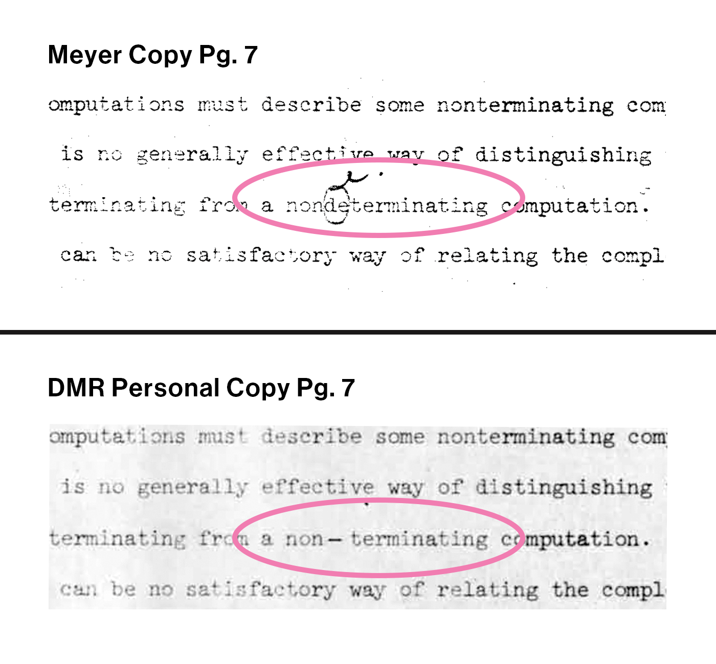
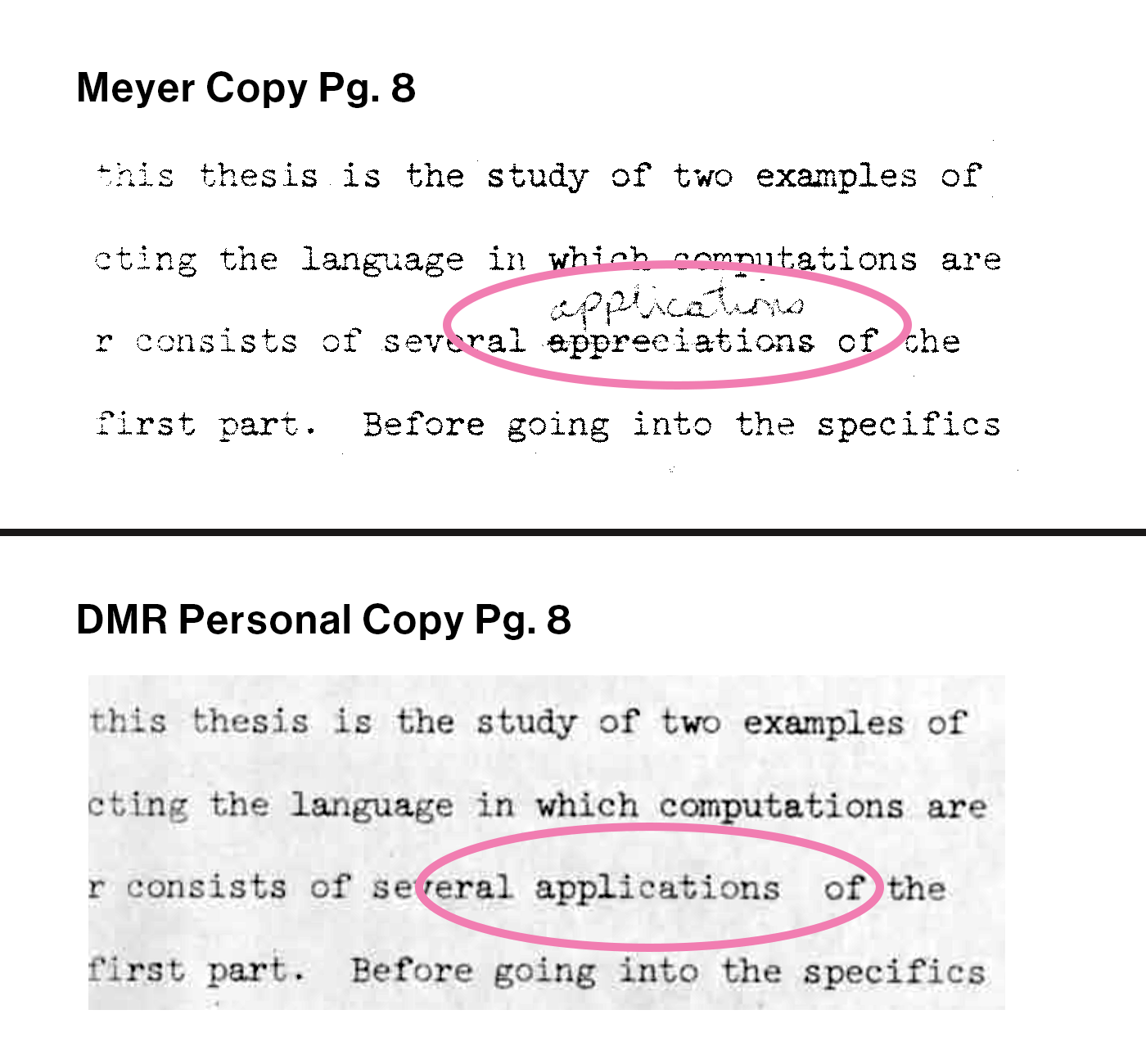
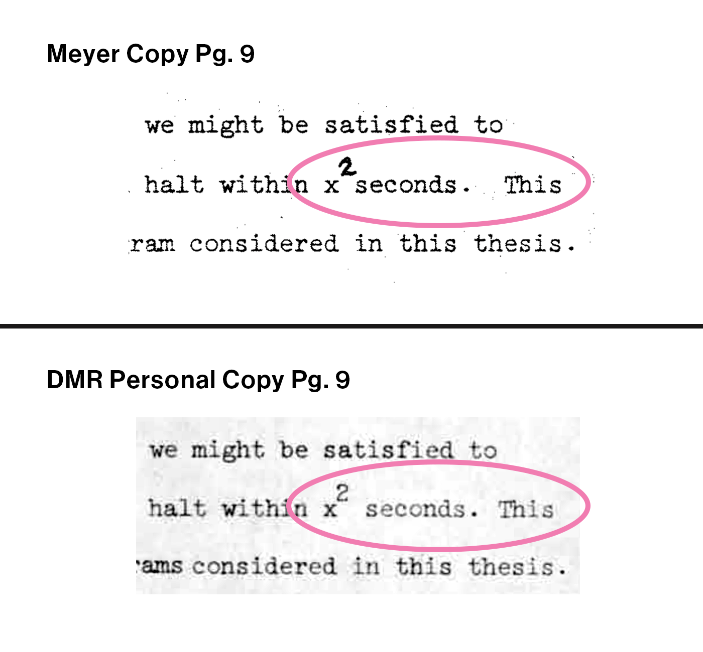
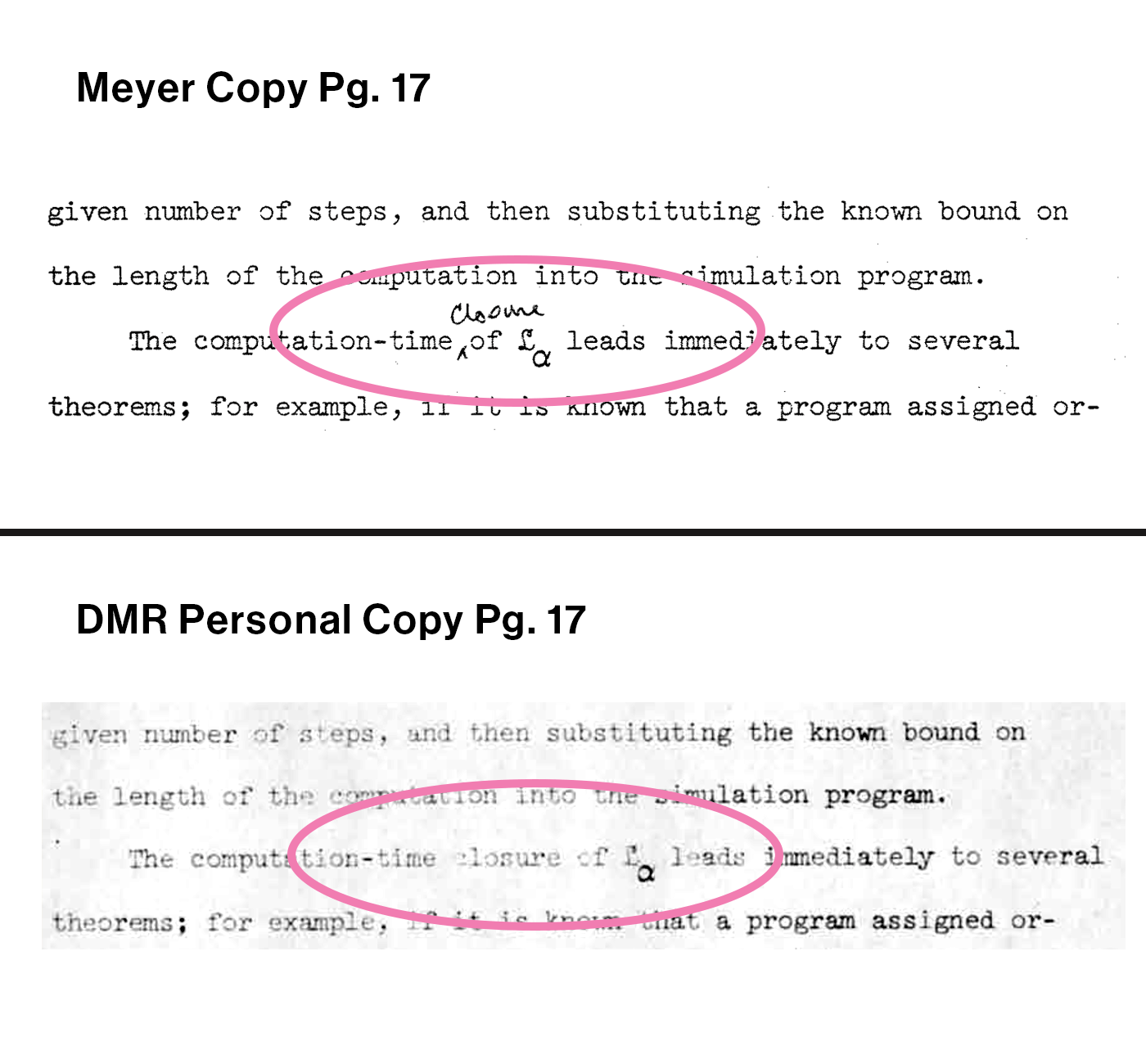
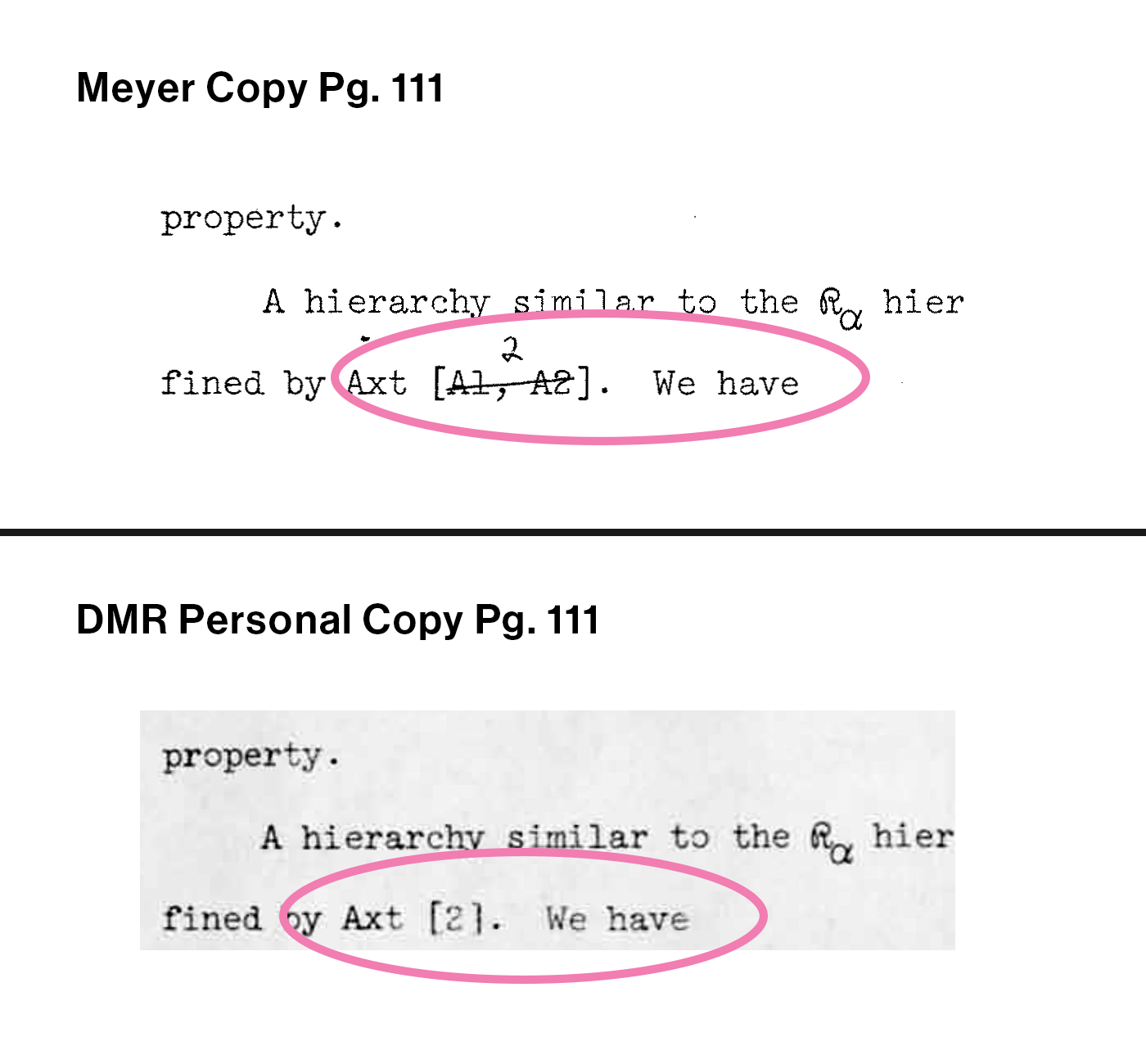
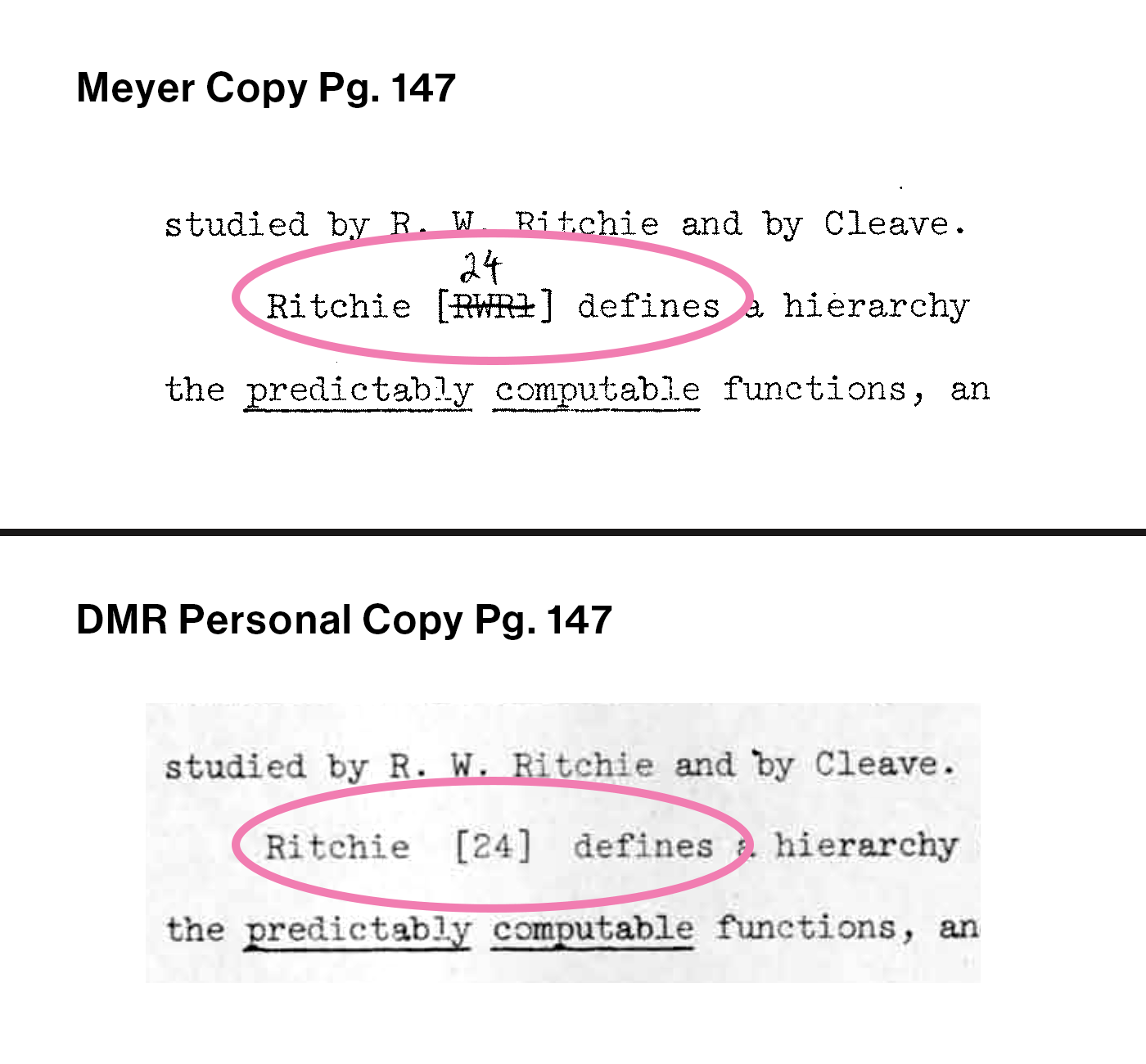
For the most part, mathematical typewriting during the 1960s was a manual process. You typed your thesis on a standalone machine, preferably a Selectric, or you hired a professional typist to type it for you. Typewriters of this period did a poor job of supporting mathematical expressions… if you wanted to use a special symbol and didn’t have access to a Selectric, you hand-inserted it into your machine using a special stick called a Type-it. If you wanted to type a subscript or superscript you needed to release the machine controls and adjust the platen by hand.
Brian Kernighan describes this situation in “UNIX – a History and a Memoir”, pg 99. –
“…It may be hard for readers today to appreciate just how labor-intensive it was to prepare documents before the creation of word processing programs, when there were only mechanical typewriters – better than clay tablets or quill pens, to be sure, but any change of more than a few words in a document would require a complete retype. Thus most documents went through only one or two revisions, with handwritten changes on a manuscript that had to be laboriously retyped to make a clean copy.”
In 2010, mathoverflow.net launched a discussion asking people to describe what it was like to type a math thesis before LaTex. Here is a link to the discussion board… and a sampling of the descriptions from that conversation…
“I typed my thesis in late Winter 1963, on an IBM Executive in the Bowdoin College Math Dept office after hours. This was before the Bouncing Ball (Selectric), but it had two or three removable type-bars at the side, and we had a couple of dozen special bars, each with its own character. If you wanted to type “αβαβ”, you’d have to remove the alpha-stick and attach the beta-stick. I think that there were relatively few characters I had to put in by hand: pp maybe, and certainly the inclusion symbols. It took me 45 minutes or so per page, and according to the rules at Harvard, there could be no corrections on any page (not even white-out).”
“I paid a secretary through the nose to type my thesis in 1964, doing much of it myself, and using carbon paper to get a copy. Lots of handwritten graphs of spectral sequences. The memory of that horrid process may be one reason I never published my thesis. It is roughly 150 pages of dense calculations.”
“My father was a mathematician, and, before the IBM Selectric typewriter, I can tell you that he bought an expensive manual German typewriter along with boxes of these plastic sticks, each with a metal head containing a math symbol. Very slow and very painful.”
“Later, department secretaries (there used to be more of them) would have IBM Selectric typewriters, which would use a metal coated plastic ball, and you would switch the ball to get different symbols. This normally worked pretty well, except sometimes the teeth on the bottom of the ball (which was serrated for some reason) would break. This would mess up the typing action, so it would no longer type the symbol or character properly.”
“I paid the technical typist in our department to type my PhD thesis on her IBM Selectric typewriter. After it was complete, I noticed that she had omitted an entire paragraph of one of the proofs in an early chapter. To correct this would have required her to retype a large chunk of the thesis, so I let it pass. During my defense, the external examiner remarked that this particular proof was a little terse…”
These quotes give a great sense of the barriers to efficient and effective math typing in the 1960s.
The summary we take is…
- If you didn’t have a Selectric, typing math symbols was difficult.
- Whether you had a Selectric or not, typing subscripts and superscripts was difficult.
Jerry Saltzer, inventor of Runoff (early text editor), describes with references to the Selectric operating instructions how a typist could actually work the machine to create sub-and-superscripts on the Selectric…
“With the Selectric typewriter, not only is the platen pin-feed, it seems to be driven by a gear and ratchet to maintain precise vertical alignment and interline spacing. But there is also a lever, called the Line Finder on page 15 (PDF page 17), that can release the ratchet so that the operator can temporarily position the line up or down by hand. The Line Finder lever then can reengage the ratchet to realign the platen on the original line.
The Cardholder (on PDF page 16) provides both vertical and horizontal alignment lines.
It looks like the cardholder’s alignment lines, used in conjunction with the Line Finder, would allow a perfectionist with a good eye to do a good job of aligning sub- and superscripts.”
Contemporaneous Math Dissertations
We have looked through available collections of the best math dissertations from MIT and Dartmouth during the 1960s, to identify what were the typing standards from this period. As expected, we found that a doctoral thesis would be double spaced using a six-per-inch line height, three typed lines per inch. Most but not all dissertations were typed using 10 pitch, meaning ten monospaced characters per inch.
Some dissertations were printed using 12 pitch, 12 monospaced characters per inch. Dennis’s Harvard thesis was typed using 12 pitch.
The evidence from these pages shows a variety of spacing adjustments and slight rearrangements that is consistent with Jerry Saltzer’s description of customized positioning. While there is a lot of variety across documents and we haven’t mastered the subject, there seems to be a general pattern with the PDFs we examined to show that subscripts and superscripts do not calibrate to line heights, they appear to be hand placed using manual adjustments.
MIT Examples of Sub & Superscript
The Exceptionalism of the dmr Thesis
Dennis’s thesis was different than others of his generation. It was so chocked with sub-and-superscripts, it used so many math symbols, it was so consistent from version to version… it doesn’t seem possible for each character to be manually adjusted and individually typed.
We’re not claiming that we know what he did. What he appears to have done, could not have been done based on the technology of his time.
Instead, we want to offer a speculation about what he might have done. We will show you a dozen sample pages that illustrate our assertion. We each can look for ourselves to see what is revealed, and each of us react to the evidence we see.
We speculate that Dennis found a way to get more precise control over his Selectric… instead of 1/6 inch line heights, he doubled precision to 12 lines per inch. In limited settings he quadrupled control to 1/24 lines per inch. We also think that he found a way to double the precision of horizontal control. Along with 12 pitch (12 characters to the inch), he could shift certain characters a half pitch, 1/24”, right or left.
Vertical Control
To test this idea, we laid a 1/12” by 1/12” mesh grid over top of a number of sample pages from the dmr thesis. It turns out that the height of a standard character from a Selectric 12 pitch golf-ball element is pretty much 1/12” exactly. So if we were to type a block of characters on Line 1 then another block of characters on Line 2, the tops of Line 2 would just about exactly touch the bottoms of Line 1. While this placement is too close for narrative words from line to line, it turns out to be a perfect formula for subscripts and superscripts. If we type a character on Line 1 then want to add a subscript, Line 2 is the place to go.
This is different from the “80% lowered” subscripting style popular in the day which must be adjusted to by hand, these characters are on our grid which means in our speculation that they can be typed by the machine without hand adjustments.
(Show a graphic here of a 1” square snippet from the thesis. Here is a nice one, from page 50 I recommend this. Put a 1/12” by 1/12” grid on top of this, it will reveal the layout)
What we found when we applied this mesh grid to these thesis pages has astonished us. To an extraordinary extent the typed characters exactly align into the 1/12” by 1/12” system… every strike of the type ball hits exactly within the grid, placed in exactly the position it needs to be.
Rather than convincing you with words, open this link to take a look yourself at these dozen example pages. Click on an individual image if you want to pop up the full page so you can zoom in and inspect as closely as you wish.
Horizontal Control
Our grid system reveals that Dennis had extra level control over horizontal spacing as well as vertical spacing, though not as extensively. Also… what we have found doesn’t make sense. It seems like it is just playing.
What we have done is to identify two main ways that Dennis bent horizontal spacing norms. We want to showcase them rather than explain them.
Roman Numeral Lists
Dennis used a “Roman Numeral” listing technique for enumeration when necessary. This is an important technique for him, he used it 16 times.
All characters in the first three lists conform to the 1/12” by 1/12” grid system.
However, starting with the fourth list on page 39, a remarkable change occurs… the Roman Numeral lists center-justify, so that the numeral “(ii)” splits the difference with numeral “(i)”, all characters shift one half step (1/24”) to the left. Similarly, “(iv)” shifts 1/24” to the right from “(iii)”.
This and the remaining 12 lists are all center-justified. This means that each even-numbered-numeral on each list, has been adjusted by 1/24” to the left or right from the 1/12” grid.
It gets weirder. For fifteen of the Roman Numeral lists, the main body copy below the list itself is justified inside the grid same as the copy above the list.
Page 45 is an exception: all characters in the final nine lines of this page are half-shifted off the grid, in alignment with the final numeral (x) of the Roman Numeral list on that page. Maybe there’s an easy explanation, like the typist forgot to adjust back after finishing off the “(x)”. Or maybe somebody forgot to reset the routine?
Plus “+” Spacing
All the characters in the dmr thesis are expected to stay inside the grid except for one… the “+” sign. At certain times, this symbol is adjusted by a half pitch (1/24”) left or right.
Here we present three sample pages to demonstrate the unique behavior of “+”. We don’t know the rhyme nor reason that was used to choose one or another. Theories anyone?
Page 136 reads as a trophy page for the standard “+” that fits within our standard grid. This page is chocked full of Plus signs: 52 Standard “+” characters and 2 Extended “+” characters tucked in as well. We color coded them to identify which are which (pink arrows are extended).
Page 66 has a distinct typographic feel to it… most of this page consists of actual programming code rather than narrative or equations. On this page we observe that all 8 of the “+” characters are shifted by exactly half a space, 1/24”, off the grid, we can see that they straddle the vertical grid lines. This is different!
Page 76 demonstrates how seemingly interchangeable are these two “+” forms at times. There are 15 uses of “+” on this page, 8 of them are standard grid (black arrow) and 7 are shifted grid (pink arrow). Note also, four of the standard plusses here, are split to a 1/24” center vertically… take a look for yourself! This is not incremental… Dennis was making choices here.
Version Control
The “Meyer” version of the dmr thesis was completed in January 1968 and sent to two colleagues for review. Dennis marked small edits in pencil onto 30 pages across the document.
The “dmr personal” version is the near-final, corrected draft we think that appeared a month later, in February 1968. Virtually all the Albert Meyer edits were corrected in this version. It is just six small corrections away from being complete.
To give you a clear picture of the “before” and “after” of the actual edits that were made, we show six representative examples You can see in each case that the correction was as surgical and precise as possible, removing just the right number of characters and replacing with new characters as needed.
At first viewing it is remarkable how cleanly these new characters are placed into the new draft, no mis-alignments or unusual markings, they look fully integrated into the new document.
In the larger context, what is even more remarkable is that the rest of dmr personal document… everything except the few snippets that were edited… seems to be an exact clone perfect copy of the Meyer version. For page after page, every superscript and subscript and Greek letter and indentation and everything else appears to be identical between the two versions, on the 30 pages with edit corrections as well as the 150 unaltered pages.
Let’s recall the words of Brian Kernighan…
“…any change of more than a few words in a document would require a complete retype. Thus most documents went through only one or two revisions, with handwritten changes on a manuscript that had to be laboriously retyped to make a clean copy.”
We don’t understand what is happening here, except to say that the version control that Dennis was running was different than the norm. We’re looking for help with answers for how this could have been.
Evidence of a Third Draft?
Combing through the documents, we have identified three specific pages that contain small but significant differences between the two drafts. Our speculation is that these pages were taken from a draft that was earlier than Meyer and were placed into the dmr personal draft, we’re not sure how this could have worked.
The strangest of these is Page 137.
Page 137 stands out first because the different indentation and line spacing between the two draft versions on this page. For all other pages in this thesis except 176-77, the indents and line spaces are identical between the two versions.
The thesis features two styles of the number “4”. Along with similar pages 176-77, Page 137 is the only page where the typographic style of “4” does not match from draft to draft.
There is an “underline” mark present in the Meyer draft, that has disappeared in the later dmr personal draft. Dennis made a red pen correction mark here in the dmr personal draft to note this, one of only six final corrections listed. This is the only instance of a character disappearing from the Meyer draft to the dmr personal draft.
For all these reasons, it appears likely that the two draft page 137s were typed separately and independently from each other.
Page 137 happens also to be particularly dense with equations, including three different 3 layer superscript expressions.
When we isolate each individual math equation, then compare its particular typography from draft to draft… what is remarkable is how the character by character positions appear so identical. Even though we are certain that these pages were typed separately.
Next Steps
In this section we have sought to demonstrate the typographic features of the dmr thesis, we argue that the evidence shows the characters align around a “12 line spaces per inch” system which could have incorporated subscripts and superscripts into a standard typing routine, no hand adjustments. Much is left to be learned.
The next step for us is to reach out to experts and contemporaries, to see if we can get an explanation for all this. We’ll report back in on what we find as we find it.
If you need to get in touch, email Bill Ritchie at: billr@thinkfun.com